Lets build a CSS-only Tabbed Content Switching UI Component
Last week we built an interactive accordion three ways:
- Non-Auto-Collapse Accordion with a Checkbox
- Auto-Collapse Accordion with Radio Buttons
- Auto-Collapse, Focusable Accordion with Focus State
All three of them relied on simple HTML and CSS features and offered three fundamentally different behaviours and excellent accessibility.
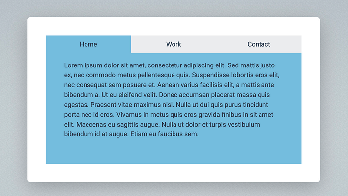
This week, continuing with the theme of rebuilding common web app UI elements without a single line of JavaScript, we focus on the classic tabbed content element:
Just so you know, this is one of dozens of cool HTML and CSS examples from my book “All you need is HTML and CSS”:
And before getting started, here’s the link for the GitHub repo containing the source files for all the examples in the book:
Starting the build with the HTML
The most important decision we have to make before getting started is choosing the type of HTML element to use: checkboxes, radio buttons or to simply rely on focus states? Let’s compare our options.
If we used three checkboxes to build the tabs then they would let the user open or close all of the tabs at the same time which is definitely not what we want so we can dismiss this idea straight away.
Opening the tab content when the tab is focused already sounds like a better option as you can only focus on one tab at the same time. But with this option you can also make them all disappear by simply clicking away from the tabs to take away the focus. That’s not great because we always want to have at least one tab to remain open.
That leaves us with the radio buttons and this will give us the exact behaviour we need: only one tab can be open at any one time and clicking on another switches to the new tab by closing the previous one. We can also make the first tab opened by default with the checked attribute.
Let’s translate all this into some HTML. All we really need is three checkboxes with three labels and some content to follow them:
<main>
  <input type="radio" name="tabs" id="home" checked>
  <label class="tab" for="home">Home</label>
  <input type="radio" name="tabs" id="work">
  <label class="tab" for="work">Work</label>
  <input type="radio" name="tabs" id="contact">
  <label class="tab" for="contact">Contact</label>
  <div id="content-home">
    <p>Lorem ipsum dolor sit amet…</p>
  </div>
  <div id="content-work">
    <p>Lorem ipsum dolor sit amet…</p>
  </div>
  <div id="content-contact">
    <p>Lorem ipsum dolor sit amet…</p>
  </div>
</main>
Adding interactivity with CSS
Comparing this HTML with the markup of the accordion we built earlier we can see that the content blocks controlled by the radio button elements are still siblings but they were completely separated.
This time, however, we can no longer use very abstract selectors and say “select the element with the content class that is the general sibling of a checked radio button”:
/* this will not work */
[type="radio"] ~ .content {}
Doing something like this would not work because all three content blocks are general siblings of all radio buttons so all tabs would be visible all the time.
Instead, we will make our selectors a lot more explicit by working with IDs:
[id^="content"] {
  display: none;
}

#home:checked ~ #content-home,
#work:checked ~ #content-work,
#contact:checked ~ #content-contact {
  display: block;
}
This will make it obvious which radio button should control which content block: if the radio button with the home ID is checked we display the upcoming content with the content-home id.
To make things a bit more visually appealing, let’s style the tabs and the content boxes:
main {
  padding: 50px;
  height: 100%;
}

[type="radio"] {
  display: none;
}

.tab {
  display: block;
  float: left;
  width: calc(100% / 3);
  padding: 10px;
  background-color: var( - grey);
  text-align: center;
}
And that is all!
This gives us the basic behaviour of showing and hiding the relevant content by clicking on the tabs. But we can make this look a bit nicer by colouring the currently selected tab and content blue:
[id^="content"] {
  display: none;
  padding: 50px;
  background-color: var( - blue);
}

[type="radio"]:checked + .tab {
  background-color: var( - blue);
}
The final touch is going to be some underlined text in the tab labels when the mouse pointer is over them:
.tab:hover {
  text-decoration: underline;
}
And with that, we’ve completed the tabs:
Conclusion
When we think about possible use cases for the checkbox and radio button it might be difficult to think outside the box. We usually think about simply switching block elements on and off, hiding and showing them in one way or another. This is exactly what we did with the modal, the accordion and the tabs.
However, if we focus on the different state changes these elements represent, we can easily come up with more complex ideas.
How about trying to build a star rating widget with no JavaScript at all? That’s what I’m going to do next week!


